There is nothing more unfortunate for an e commerce business than losing customers over a badly designed check out page. Even as consumers ourselves, we have probably been at the receiving end of a check out system which was not at all user friendly and even dissuaded us from making purchases in some instances. An efficiently designed check out process with link fire seo is the goal of every company involved in e commerce.
Web developers aim to design websites and each page within this website with the purpose of converting window shopping visitors into frequent customers. However, this objective is extremely hard if not impossible to achieve if time, money and efforts are not exerted into ensuring a smooth check out process with a well designed check out page. What do customers want? They want a check out process which is as smooth and quick as it can possibly be and website designers should be mindful of this.
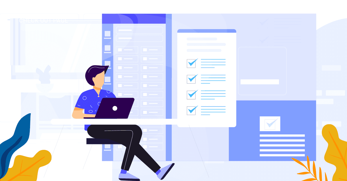
Here are five reasons that should push you to redesign your check out page in order to ensure that casual visitors go on to become frequent website users and customers.
1) Registration requirement
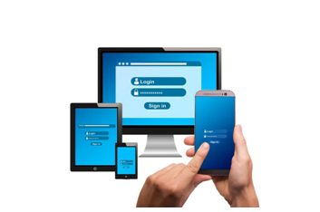
It is always preferable to design your website in a way that allows guest visitors to make purchases without the need to sign up as a member. No customer who is stopping by to shop wants to fill extra forms while they are there and they might even leave the website if they find the process to be too time consuming. Needing to register before you can even add products to your shopping cart is an unnecessary hassle which may lead to abandonment.
Registration forms are a very real barrier in the shopping experience especially if they appear at an inconvenient time and are too lengthy to fill. Customers want a check out page that is as simple as possible. By designing a check out system which ensures this, e commerce businesses can greatly augment the number of visitors who will become loyal customers.
2) Lack of Speedy Customer Service
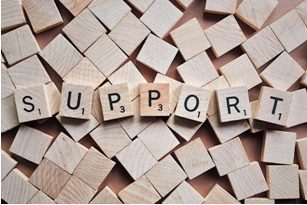
What if something goes wrong during the check out process? A problem during the payment procedure or some confusion regarding the information that needs to be shared. It is quite reasonable to assume that misunderstandings will arise during shopping that are not adequately addressed already provided guidelines. There could be a hundred reasons why a customer would want to get in touch with a company representative and being unable to do so can be extremely jarring. The ready availability of contact persons can make or break a sale, can save an abandoned cart.
While FAQs and help sections are usually present on websites, they take a lot of time to go through and are generally not as specific as real time correspondence can be. It necessary to have a method of providing well trained, personalized assistance to customers – much resembling the actual interactions which take place in a shop with a salesperson.
Users of the website are very likely to use real time customer service if the option is available, even if it is just to clarify minor confusions and get answer to mere queries. Moreover, the very fact that someone is available to help them in case there is any trouble has a cushioning effect and creates a good overall impression for your company. Web chat assistance is always a good idea to incorporate and is more easy and cheap to execute now than it ever was before!
3) Progress Indicator

The universal opinion is that the fewer the steps of the checkout there are, the better it is for customers. No user wants to sit through a hundred steps just to make a small purchase. More steps can be intimidating and perplexing. However, they are certainly more likely to be patient if they know exactly how many fields are required to be filled and how many steps are left. For this purpose, the best option is to opt for a linear view of the check out process.
A non linear, confusing and all over the place check out page is possibly the major reason why customers abandon carts. The check out process needs to be as hassle free and easy as possible. The best solution is to design a check out page which includes a linear experience, with progress being indicated on the screen as well. Even in instances where registration is required, the website should be designed in a way that the user is redirected to the check out page after signing up automatically, instead of them losing progress and starting from scratch.
4) Security Seals

Letting your customers know that their financial information is in safe and competent hands can really work in a company’s favor. Nothing can achieve trust better than the display of security seals on your website. Web designers should ensure these seals are on every step of the check out page.
The presence of security seals has the ability to grant your customers peace of mind and assurance that they will not be victims of any money embezzlement or fraud.
5) Interactive and Descriptive

Last but not the least, companies should ensure that their check out page has descriptive labels on every field, complete with the option to edit easily and save progress side by side. A ‘back to shopping’ button and easily understood calls to action can work wonders for your check out page!
Contact webnexs and get a free consulting for your business
Check out Best Website Designs of 2020

Leave a Reply